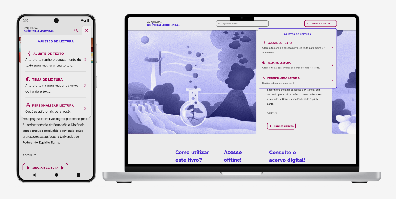
A web project developed by the Superintendence of Distance Learning (SEAD).

Problem
The book had some limitations and outdated functionalities that did not fully meet the needs of its users. These users could include people with disabilities and/or elderly individuals with health conditions that made reading difficult.
My role
Researcher, responsible for working on research into the user profiles that would be served by improvements to the accessible web book, and designer, responsible for user experience (UX) design and user experience interface (UI).
Other team members
- Edson Rufino – Coordinator, researcher, and designer
- Hellen Rodex – Researcher and designer
- Rafael Moraes – Researcher and designer
- Semiramis Louzada – Researcher and designer
Research
The project’s initial phase involved gathering information about people with disabilities and elderly individuals.
Each team member contributed by researching different profiles, identifying their needs, and evaluating what the existing book failed to address properly.
The Web Content Accessibility Guidelines (WCAG) served as our main reference.
In my research, I focused on the profiles of blind users, users with low vision, and users with motor disabilities.
Reseach findings
The following key aspects were identified:
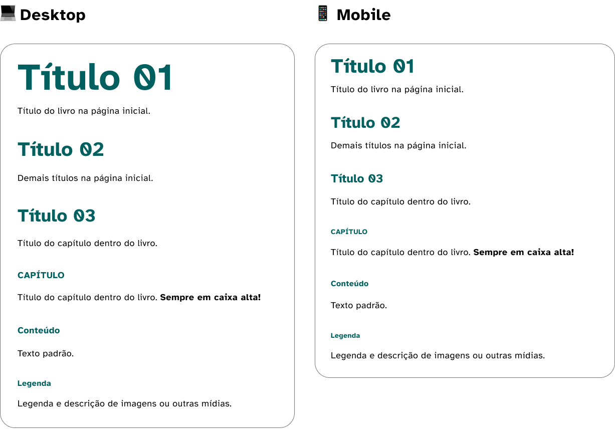
- Typography: Use of sans-serif fonts
- Text resizing: Ability to increase text size
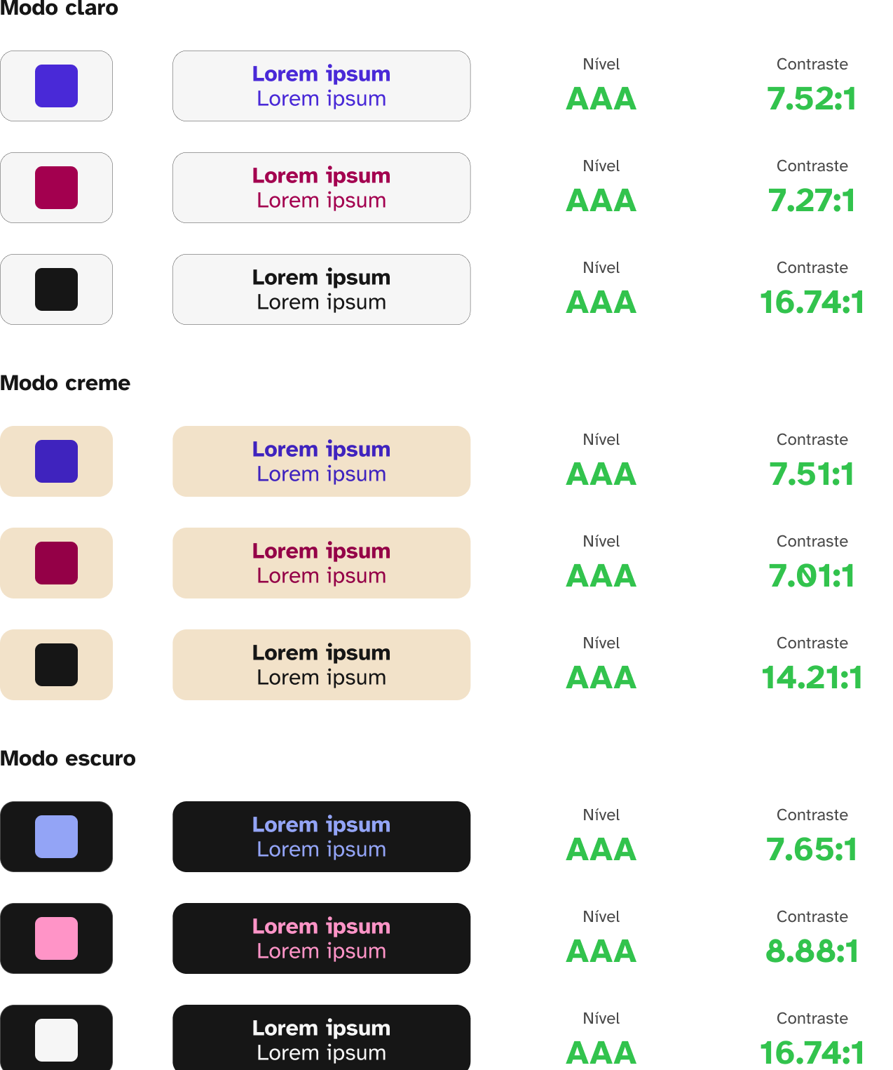
- Contrast: Ensure good contrast, proper font size, and adequate spacing between letters and lines
- Content layout: Improve structural clarity by increasing spacing between content sections
- Content responsiveness: Automatic resizing to ensure functionality across mobile and desktop devices
- Types of images: Avoid using images in place of text
- Image descriptions: Provide alternative text descriptions for images and graphics
- Focus selection: Enable the TAB key for navigating interactive elements
- Heading structure (h1, h2…): Screen readers should easily identify headings to allow users to jump between sections using the keyboard
- Page titles: Titles should be correctly defined, as they are the first elements read by screen readers
- Link text: Avoid vague links like “click here”; instead, use descriptive links embedded in meaningful text (e.g., “Read more about this topic”)
- Content lists: Use proper list tags so screen readers can identify them correctly
- Accessible button names: Use aria-label to assign clear names to interactive elements, whether visible or not
- Labeling elements: Interactive elements must have labels to support voice input commands
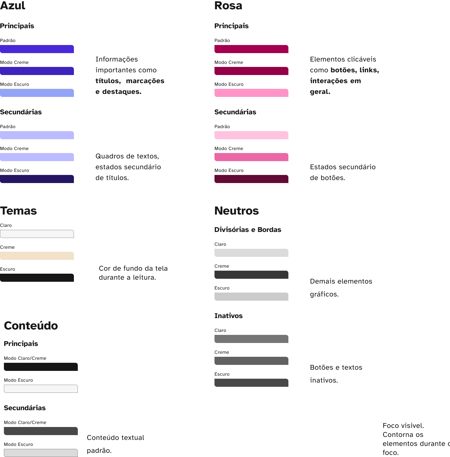
- Recommended colors: Do not rely solely on colors to differentiate elements; use shapes as well, as some users may have difficulty perceiving colors.
Colors

Accessibility

Typograph
